
Several years ago, United Airlines started searching for ways to more effectively integrate and analyze complex data across multiple databases and work streams. We wanted an automated solution that would be simple to use; clearly communicate vital information; provide real-time, around-the-clock access; automatically update; and, most importantly, be accessible to 80,000 users in the 350 destinations around the world to which United operates. The airline needed a multilingual solution that was easy to interpret so that anyone, from front line employees to the CEO, could look at it and come to the same conclusion. The solution we found initially had nothing to do with either aviation or safety; our data visualization revolution came from a partnership with the University of New Haven and its criminal justice program’s partnership with the U.S. Department of Justice (DOJ).
Data visualization is allowing United to centralize volumes of “big data” in a data warehouse to design highly interactive dashboards and maps. By linking multiple data streams and identifying correlations, we have improved our safety programs to reduce employee injuries and prevent aircraft damage, while also leveraging the program data to improve key operational performance metrics. Expanding how we look at data, we continuously focus on incorporating new data sources to expand into areas such as safety management systems (SMS), facility readiness and ground support equipment. By integrating data across all divisions and pinpointing risk “hot spots,” mindsets are being changed. Individuals with an intermediate to advanced familiarity with Excel and data analysis can begin building data visualization dashboards with only two days of training. Information technology (IT) support is required only to maintain servers that house our data. By using off-the-shelf software, our business users can own and modify their business intelligence solutions, while freeing up our IT resources to maintain the infrastructure.
Simply put, data visualization allows for the aggregation of big data to show correlations in visually pleasing, interactive dashboards that offer game-changing insights that equip operational leaders with the tools to execute an effective root cause analysis program. At United, data visualization has become the foundation for a step into predictive analytics.
How We Got Here
In 2014, Mike Quiello, United’s vice president of safety, attended a presentation conducted by the University of New Haven’s College of Criminal Justice and Forensic Sciences. The school had been working with DOJ to collect detailed crime information from public sources, such as police reports and articles in newspapers and other media outlets. By plotting this data into interactive maps, the DOJ could see which crimes were increasing or decreasing, and in which parts of the city. The maps communicated where law enforcement should focus its efforts regarding specific crimes, down to the street level. Quiello, who also is a member of Flight Safety Foundation’s Board of Governors, brought the concept back to United asking, “How can we apply the data visualization process to our operation?”
Each of our hubs is comparable, in size and complexity, to a small city: thousands of people, working several hundred flights per day (United’s hub at Chicago O’Hare International Airport (ORD), for example, dispatches an average of 500 flights per day), and utilizing thousands of pieces of equipment. Just like plotting city crime onto a map, we imagined plotting other types of events. We initially defined an event as an employee injury or aircraft damage. Working with the University of New Haven, we established an experiential internship partnership with the criminal justice college in which students would work remotely, from campus, to apply their skills and United would provide mentoring, career coaching and experience as to how a large company operates.
In its program, the school was taking different types of data, from multiple sources, and storing them in a data warehouse, which later fed into off-the-shelf software. Running with this concept, we asked, “Why aren’t we integrating data, from multiple programs, in Safety?” We needed a company-specific solution to condense voluminous reports being processed on spreadsheets, and, working with the interns, we realized we could take millions of pieces of data and graphically show injury events by location, time, date, “lost time,” length of time out, cost, injury type, body part, quantity, task being performed, and equipment utilized, as well as year-over-year performance with details on demand. This could be done on a single interactive dashboard.
Interactive Dashboards: A New Look at Injuries
The dashboards are designed to illustrate reams of complex data and enable us to identify and target data outliers, which can be the quantity of events, the severity of an event, an impact to the site, or cost. To keep things simple, we focused several dashboards on the concept of “work the big red dot or X.” Figure 1 shows a standard dashboard. Each graphic we produce is interactive and mineable. Clicking on a specific area, such as a gate on an airport map, a zone on a bar graph, or a month on a line chart, will provide detailed data on that feature and update all graphics on the dashboard within three seconds. A supervisor can quickly review his or her gates; an area manager, his or her zones; and a general manager, the entire airport. The map points depict process variability between gates (opportunities to improve).
Figure 1 — Weekly ORD Safety Report
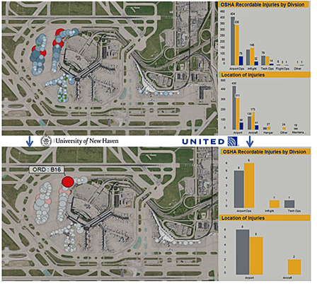
Our model at United is to allocate manpower and equipment to a gate based on the aircraft type using the gate and the number of turns, which is the number of times an aircraft arrives and departs from a gate during a shift or during the day. Theoretically, injuries and damage should be proportionate. The map shows that this is not the case: We have gates with excellent performance and gates with opportunities for improvement. Focusing continuous improvement efforts on the gates with the “big red dots” has the greatest impact on keeping our people safe.
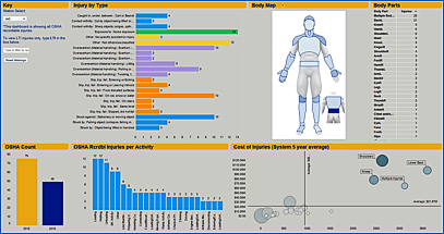
Breaking it down further, Figure 2 captures injury details, including activity being performed, quantity, type of injury, trends and body part impacted. This chart highlights the opportunities we are focusing on to improve safety. We use similar dashboards to track aircraft damage. Establishing standard designs allows users to easily understand and use other dashboards.
Figure 2 — Injury by Type
The Next Frontiers
After having success in safety and aircraft damage prevention, the next step was to move into qualitative data analysis. Qualitative data tells us about process variability from a systematic perspective: line observation safety assessments/audits (LOSAs) performed by peers, voluntary disclosure reports (VDRPs), audit reports, letters of investigation (LOIs), and safety action program reports. All of these reports are de-identified to encourage positive reporting while still showing opportunities to improve our safety programs. In essence, these reports capture near-miss events, abnormalities, process deviations or noncompliances. Other common themes with these programs are that they require investigations and corrective actions, both subsequently processed and risk-coded. Just like the University of New Haven police reports, the qualitative United reports can be aggregated.
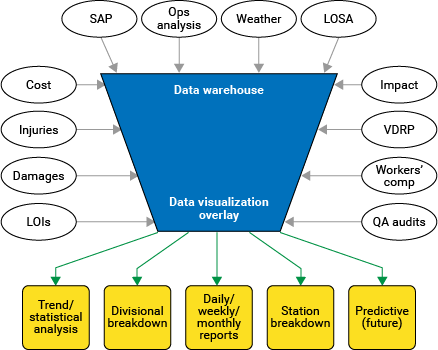
We are using an approach similar to that of a doctor who performs several tests to look for leading indicators of a patient’s health. Multiple data sources are being aggregated to diagnose the health of the divisions, or of processes. Figure 3 reflects the top level construct used in aggregating data, as well as the intended design outputs. All of the items are pulled from existing databases and stored in the data warehouse. Our biggest challenge for visualizing these correlations was establishing common process codes. Initially, we wanted to accommodate all 250 existing process codes, but 250 proved to be too many. After careful analysis and collaborative decision making, we settled on roughly 70 codes.
Common codes provide a common language to aggregate data at the system level (company, division) or site level (hub, line station, garage or domicile). Reducing the number of codes simplified our process while increasing the flexibility that we needed to perform data visualizations. Simplification provided the opportunity to aggregate data while still providing key trending data at each level of the company.
Data storage is mined by all columns, not just the document qualifier. Mining columns allows the flexibility to query any data field. For example: A search can be done by site, type of damage, or type of aircraft. By providing all columns with common features, our focus is to provide one-stop shopping to stakeholders for all safety related data through a single portal.
Figure 3 — Approach
Piecing It All Together into an SMS Framework
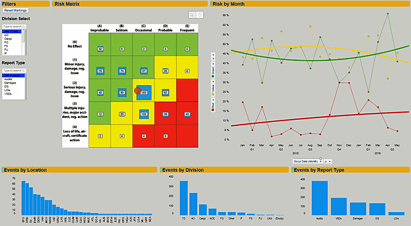
Being true stewards of the SMS, we quantified quality, regulatory, disclosure and safety events by visualizing the data on the SMS risk matrix. Figure 4 highlights our quantified risk on an interactive 5 by 5 matrix. The accompanying run chart depicts our risk levels, indicating whether they are increasing or decreasing over time. The inquiry fields on the left side of the dashboard allow a user to filter a specific division or type of report. Additionally, we can mine locations by clicking on the locations bar chart. All of the graphics are interactive: By clicking on the matrix box, for example, all of the bar charts and line charts will filter to the items on that specific element. Finally, by clicking on “details on demand” (not pictured), we are provided with a complete summary of the events embedded behind the graphic element selected.
Figure 4 — SMS Risk Matrix Dashboard
Ultimately, if you were to look at a hub location like ORD, within seconds you could access its entire audit history, and its disclosures, LOIs, damages and dangerous goods events. Report preparation time can be cut by over 50 percent. Using the complete set of data, a person would have the entire history of injuries and damages, drilling down from a station to a specific set of gates. A complete history for a division or site can be pulled and reviewed within minutes.
Correlating Risks
To correlate the data, we look at audits, injuries, damages, VDRPs, LOIs and LOSAs for themes. Common themes show variances in adherence to policies or procedures. In an SMS these items all are risk ranked and coded (severity versus probability). Plotting multiple items on a risk matrix clearly shows our risks from multiple sources. Establishing common process codes allows for similar risks to be correlated, facilitating our search for common themes. We now can show the relationships between our quality assurance programs and regulatory compliance, with an overlay to our safety performance data.
Having one source of information eliminates numerous emails and stand-alone reports. Additionally, providing one data source to our global network allows general managers to quickly view multiple data streams and identify improvement opportunities. By addressing noncompliance or near misses, we prevent serious safety impacts. Graphic representation provides transparency and the simplification of very complex data to the exact “hot spots” needing attention.
In the end, taking massive amounts of data and providing simple, real-time maps reduces frustration and allows our employees to make better decisions. By keeping it simple, we expand the base of safety advocates.
Measurable Results
The transparency created by this program has resulted in the reduction of hundreds of injuries by proactively recognizing hazards and conditions that cause injuries. By improving the quality of safety to our people, we have saved millions of dollars in injury costs, medical treatments, claim management and associated overtime. More importantly, we prevented 900 injuries in the first two years of the program. Philosophically, everyone who comes to work should go home in the same condition they arrived. Making the data transparent is a great enabler for people to see how we are doing and accomplish our goal.
Over the course of the program, a 31 percent reduction in aircraft damages has been recorded, along with gains in operational performance achieved through increased reliability. We witnessed an interesting phenomenon: By running a reliable operation, fewer work-arounds occur, resulting in a safer operation.
Moving away from reactive metrics and toward leading indicators has shown a direct correlation to achieving the performance we want. By mapping our audit and LOSA data, we have identified system and process trends impacting a division, or even a specific location. Visualized data allows for bringing multiple systems together. For instance, we can show if risk is increasing or decreasing over time, providing the opportunity to make adjustments to our audit and LOSA programs. One of the most interesting aspects is the expedited mining of data for effective cause and corrective action: In less than five minutes, we can look at thousands of items, determine trends and indicate the repetition of an issue.
Dashboards are designed to provide a system’s status. All are intended to communicate system health, like the SMS program, and communicate to managers where the top risks are, allowing resources to be applied appropriately.
Data visualization is about integrating data that provide keen insights to improving safety, a clear picture of complex data, opportunities for operational performance improvement, and areas where costs can be reduced. Analysts can now access a data warehouse and review the health, safety and performance of our Safety programs, any time and from any place. Analysts, who were spending most of their time processing data, can now concentrate on true analysis.
Other wins have been:
- Round-the-clock accessibility;
- Improving situational awareness of events that may impact a gate or zone;
- Data visualization expansion for divisions to operate their own data analysis;
- Increased communication among divisions;
- Improvement of data flow and understanding through the use of centrally located data;
- Executive leadership support and endorsements;
- The U.S. Federal Aviation Administration’s recognition of United Airlines as a pioneer in data visualization;
- Adoption of the same approach by other airlines that have asked for our support to implement their programs;
- Zero time wasted on requests for data;
- No single points of failure; and,
- Establishment of a proven data warehouse to move into predictive modeling.
Our philosophy with sharing the program with the world is that aviation safety is essential for us all, at every level. By sharing, we hope to improve the safety of the industry, which is good for all of us.
Looking Back While Moving Forward
When looking at data, there are several commercially available software products. Our success has been our ability to correlate division data with safety data. Every dashboard is designed to have safety, performance and cost components. By having these elements in the design of every dashboard, we can speak about the business aspects of the program, operational performance and overall safety within any specific site or division. With the philosophy of making the business better, we have always been given access to data — although confidential data, such as names and employee numbers, are never used. The program’s intent and success has been in identifying opportunities and making a difference in how we operate.
Partnering with the interns at University of New Haven has been instrumental in creating a new approach in how we think and use data. The students bring a high energy level, great ideas, and a focus on achieving milestones before the semester ends. A new dashboard is created every semester,3399 expanding the program’s use and capabilities. Subsequently, division stakeholders eventually manage and maintain the new dashboards. To date, four major operating divisions have established data visualization as part of their performance and analytics teams.
Predictive data is on the horizon. By having data in a data warehouse, we are starting to build statistical models showing what we can expect on an “irregular operations day,” and pointing out modifications we can make to counteract anticipated problems. This giant leap to predictive analysis was made possible with a stepping stone in data visualization.
J.J. DeGiovanni is the managing director of corporate quality, regulatory, ground safety and analytics at United Airlines. His role is establishing and ensuring United’s safety and quality programs as well as overall performance.
internship opportunities
Every semester, United Airlines partners with the University of New Haven to recruit three college interns from the College of Criminal Justice and Forensic Sciences. The students work from the university, but travel twice during the semester to Chicago, allowing them to accomplish their graduation internship requirement while actively taking other courses at the university. The United program is intended to provide students with insights into a large global operation, and enable them to determine how to manage data better and how to apply data at both macro and micro levels. Students also gain career guidance, including how to prepare for a job, write a resume and position themselves for a job interview; while also acquiring an understanding of the hiring process.
When the students are in Chicago they get a behind-the-scenes tour of the operation at O’Hare International Airport, getting a glimpse of how United moves more than 400,000 customers a day across its network. We also bring the students to our Flight Training Center in Denver to fly in our aircraft simulators. In addition, because they are criminal justice students, we connect them with our Security Department to discuss how security is constantly changing and its vital role in flight safety.

